Christopher Alexander attacks the question of “why we like this place…” in book 4, page 2, as he describes the connection between the building and the inner “I” which each of us experiences.
“What I call “the I” is that interior element in a work of art, or in a work of nature, which makes on feel related to it. It may occur in a leaf, or in a picture, in a house, in a wave, even in a grain of sand, or in an ornament. It is not ego. It is not me. It is not individual at all, having to do with me, or you. It is humble, and enormous: that thing in common with each one of us has in us. It is the spirit which animates each living center.”
CA writes mystically like this…
The last time I fell into the spell of mysticism, was in the 1970’s reading the works of Carlos Castanada as he was told to find his “special place”, the spot in a room, or on the land, that had the power, his power…
When he stopped trying so hard, he found it.
Sure, it might all be peyote talking, but the series of books he wrote had the same intangible, hold on this evaporative, inner truth, that you look for in a design that works, is alive, functions, reverberates correctly…just right.
What is GOOD DESIGN... SIZE?


Big is not bad… But if it is out of scale, not fitting in neighborhood, awkward, or an eyesore.. well, this is bad.
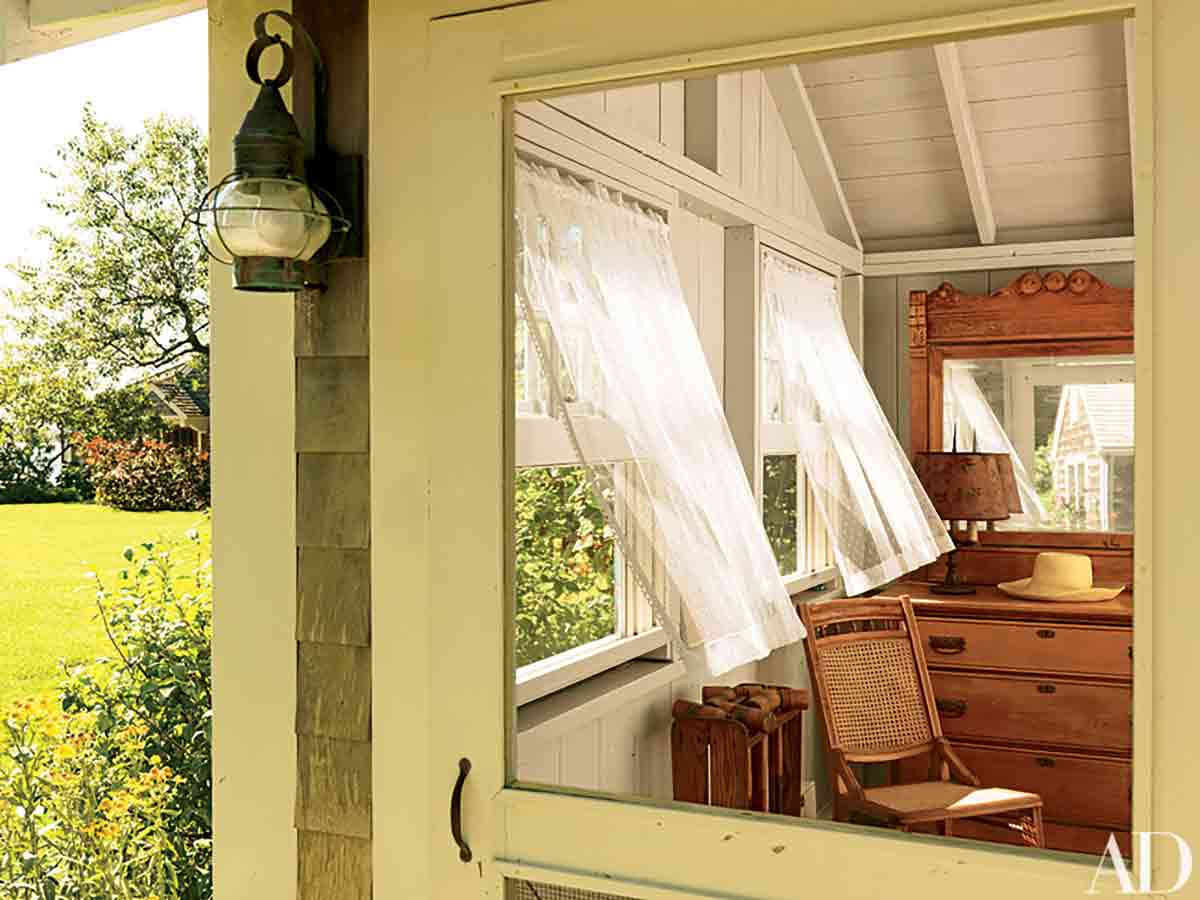
A small house, can have bad design element, strange symmetry, something off…but a few trees and shrubs kinda hide this.
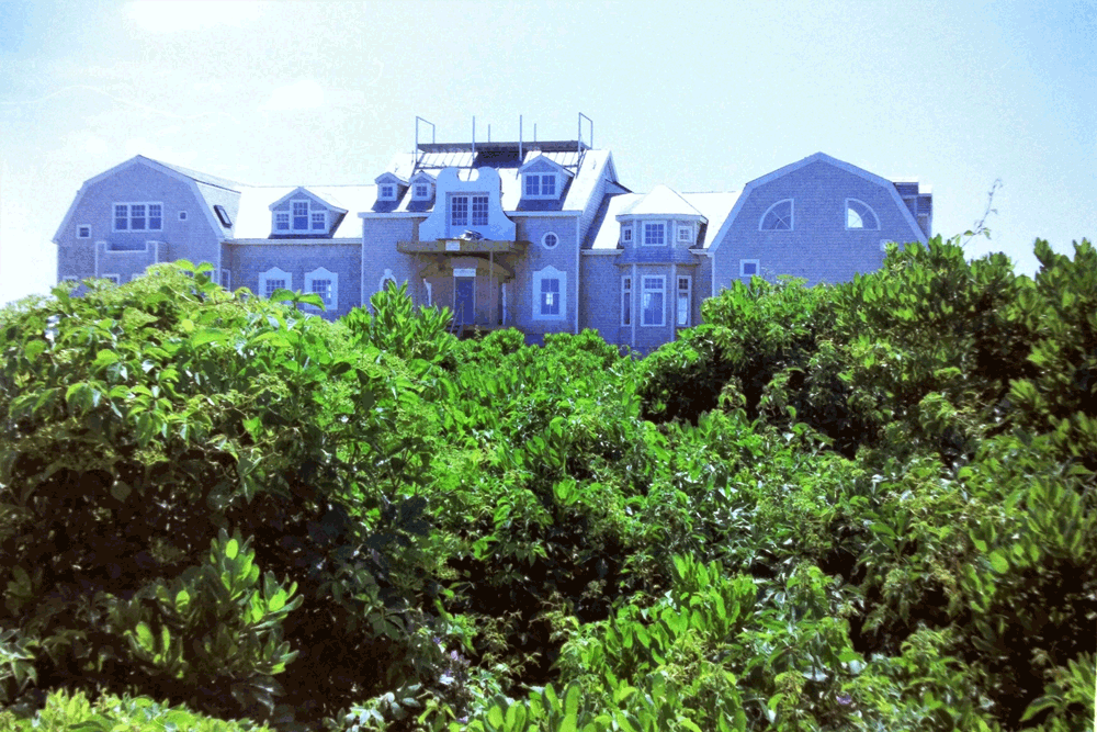
Just for fun… here is one of the first MacMansions ever built, back in 1985.
It looks like it was designed with love and enthusiasm, adding a jumble of one-of-each…window, turret, gable, roofline all for fun…
This house seemed to be designed organically by the words
“sure!
why not?
that be fun,
that’d be more,
that’d be cool”
by a businessman running a company, not building a “forever” house.
Especially odd were the small and busy windows, where the views deserved more.
Experimentation is good, but, is unsettling to the observer, trying to make this square peg fit in normal common architectural styles…
However, in the early 1980’s, it was all blueprints and cardboard models..
There weren’t 3D design software on laptops.. “Trust me” and “hope” is no substitution for seeing the house, before you build it.
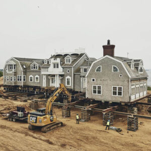
(as an aside, this house had to be lifted up and moved away from the cliffs of Nantucket a few years ago…)
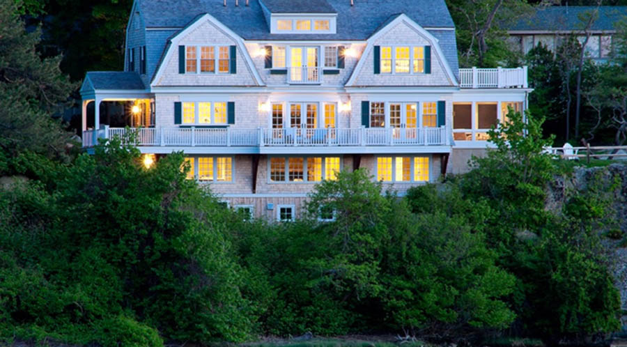
Compare these two…which is correct?
Of course, no right answer…but there are visual ticks that people are drawn to…
- scale,
- proportion,
- symmetry,
- order,
- prospect and refuge,
All built into that itchy feeling when a house just does not seem right…
Often, you can’t put your finger on it…
sometimes you don’t have the architectural vocabulary to express your gut instincts…
Try these two houses… which do you like?
This first one is a 1985 Gamble house on Nantucket, (from Procter and Gamble… get it?). It is in the news lately, since it has been moved away from the cliff, 60 feet sideways, and 100 feet back (see WSJ).
It was
Lorem ipsum dolor sit amet, consectetur adipiscing elit. Ut elit tellus, luctus nec ullamcorper mattis, pulvinar dapibus leo.
Lorem ipsum dolor sit amet, consectetur adipiscing elit. Ut elit tellus, luctus nec ullamcorper mattis, pulvinar dapibus leo.
Lorem ipsum dolor sit amet, consectetur adipiscing elit. Ut elit tellus, luctus nec ullamcorper mattis, pulvinar dapibus leo.
Lorem ipsum dolor sit amet, consectetur adipiscing elit. Ut elit tellus, luctus nec ullamcorper mattis, pulvinar dapibus leo.

